Understanding the Color Wheel
The color wheel is a fundamental tool for color harmony, featuring a circular arrangement of colors that illustrate their relationships and harmonies. By understanding the color wheel, artists can identify and select colors that work in tandem to create visually appealing compositions. The color wheel consists of three primary colors – red, blue, and yellow – which can be mixed to produce secondary colors.

Principles of Color Harmony
Color harmony revolves around the principles of contrast, similarity, and harmony. The 60-30-10 rule, for instance, proposes dividing a composition into 60% of a dominant color, 30% of a secondary color, and 10% of an accent color to achieve balance and visual interest. Similarly, analogous colors – located next to each other on the color wheel – can evoke a sense of cohesion, while complementary colors – situated opposite one another – create visually appealing contrast.
Applications in Art and Design
The color wheel tool has far-reaching implications in various creative fields. Graphic designers, for example, employ color harmony to create eye-catching logos, branding materials, and visual identity systems. Photographers can use the color wheel to enhance their shots, emphasizing specific colors to convey emotions and moods. Fashion designers, too, rely on color harmony to create stunning textiles and product lines that resonate with their target audience.
Designing Effective Color Schemes
- Determine the dominant color and use it as the primary focus.
- Choose secondary colors that complement the dominant hue.
- Add accent colors to create contrast and visual interest.
- Experiment with different harmonies and contrast levels to achieve the desired aesthetic.
Finding Your Unique Color Voice
While mastering color harmony using a wheel tool can provide a solid foundation, the key to success lies in finding your unique color voice. Take inspiration from nature, art, and design to develop a personal color palette that reflects your creative vision and resonates with your target audience. By experimenting with different color combinations, contrast levels, and harmonies, you can craft a distinct aesthetic that sets you apart in the world of art and design.
Closing the Gap with Real-World Examples
A closer look at real-world designs and art pieces can help solidify the principles of color harmony. For instance, in the world of photography, a photographer might employ analogous colors to create a soothing atmosphere in an indoor setting, or use complementary colors to emphasize a subject's emotions. Similarly, graphic designers can draw inspiration from the color wheel to design captivating logos and branding materials that resonate with their audience.
Embracing Color Harmony in Your Creative Journey
By grasping the fundamental principles and concepts of color harmony using a wheel tool, you'll be empowered to create compelling and memorable visuals. Whether you're a beginner or an experienced artist, the color wheel remains a timeless and versatile tool for unlocking your creative potential. With patience, practice, and an eye for innovation, you can master color harmony and elevate your art, design, and photography to new heights.
Putting It into Practice
- Observe the color wheel and understand how colors relate to each other.
- Experiment with different color combinations and contrast levels.
- Apply the principles of color harmony to your artistic or design endeavors.
- Take inspiration from nature, art, and design to develop your unique color voice.
A Final Word
Mastering color harmony using a wheel tool is not just about applying theoretical concepts to your creative endeavors – it's about finding your unique voice and resonating with your audience on a deeper level. By embracing color harmony and incorporating the wheel tool into your artistic or design process, you'll be able to elevate your visuals, tell more compelling stories, and connect with your audience in meaningful ways.
教程丨人像\静物\风景 分别适合哪种胶片模拟色彩? - 知乎

教程丨人像\静物\风景 分别适合哪种胶片模拟色彩? - 知乎
教程丨人像\静物\风景 分别适合哪种胶片模拟色彩? - 知乎

教程丨人像\静物\风景 分别适合哪种胶片模拟色彩? - 知乎
技巧丨胶片模拟模式怎样设定更适合人像拍摄? - 知乎
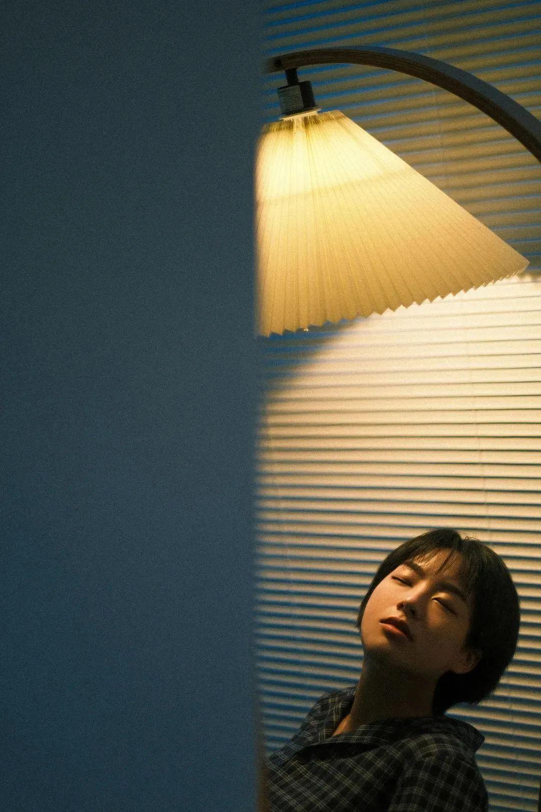
技巧丨胶片模拟模式怎样设定更适合人像拍摄? - 知乎
搭建灯光配置图 - 抖音

搭建灯光配置图 - 抖音
教你打造胶片感复古柔焦色调 - 知乎
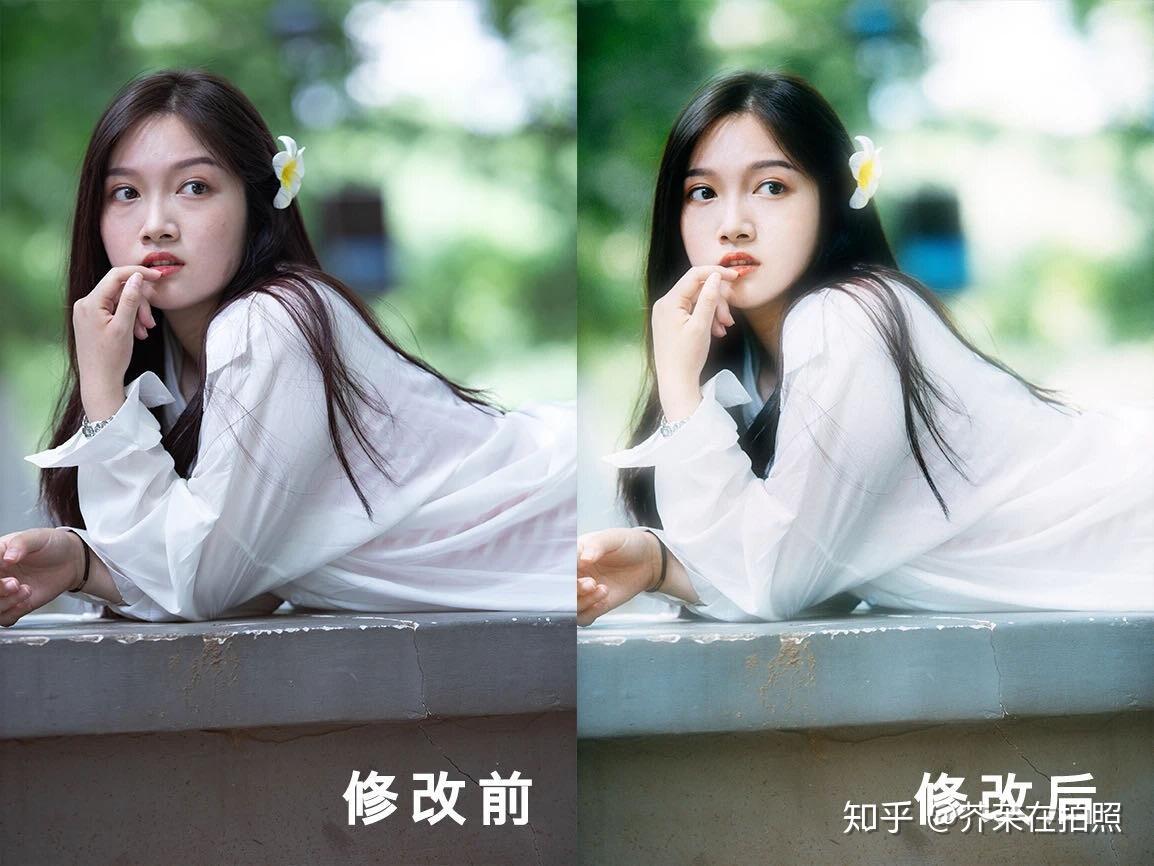
教你打造胶片感复古柔焦色调 - 知乎