Building a cohesive color palette for your personal or community wiki no longer requires a design degree or endless hours of trial‑and‑error; a handful of free tools and a clear workflow let you craft a “dream” palette in under ten minutes, and the results instantly raise readability, reinforce topic identity, and streamline future edits.
Why a Tailored Palette Beats the Default
Most wiki platforms ship with a generic set of blues and grays that work for everybody—except when they don’t. Custom palettes let you:
- Match the visual language of your subject (e.g., earthy tones for a gardening wiki, neon accents for a gaming hub).
- Enhance accessibility by choosing contrast‑checked combinations.
- Reduce cognitive load; readers recognize sections by color cues instead of scanning headings.
Compared with the “one‑size‑fits‑all” approach, a purpose‑built palette turns a page from a static repository into a memorable experience, much like a well‑chosen outfit makes a first impression.
Step‑by‑Step: Crafting Your Palette in Minutes
The process can be broken down into three rapid actions.
- Pick a base hue. Use a free color‑picker like Coolors or the browser’s built‑in inspector; select a shade that already appears in your logo or a dominant image.
- Generate supporting shades. Apply a systematic rule—e.g., lighten by 15 % for backgrounds, darken by 20 % for headings, and add a complementary accent from the opposite side of the color wheel.
- Test for contrast. Paste the hex codes into the WebAIM contrast checker; adjust until normal text meets a 4.5:1 ratio and large text hits 3:1.
With these actions, you’ll have a primary, a secondary, a background, and an accent color ready to copy into your wiki’s stylesheet.
Traditional Palette vs. DIY: A Quick Comparison
| Aspect | Default Theme | Your Custom Palette |
|---|---|---|
| Brand Alignment | None | Directly mirrors logo and imagery |
| Accessibility | Often marginal | Verified contrast ratios |
| Visual Cohesion | Mixed tones | Harmonized hue family |
| Maintenance | Frequent tweaks needed | Stable once defined |
Practical Tips to Keep Your Palette Fresh
Even after the initial ten‑minute sprint, a few habits will prevent color fatigue.
- Document the palette. Create a simple markdown table with hex codes, purpose tags, and usage examples; future contributors will copy the right shade the first time.
- Limit the palette. Stick to four or five colors; extra hues dilute visual hierarchy.
- Seasonally refresh the accent color only—swap a teal for a rust hue to celebrate a weather change without overhauling the whole scheme.
What Happens After You Publish?
Once the stylesheet is live, monitor two metrics for the first week:
- Page‑view bounce rate on theme‑heavy articles—lower numbers suggest better engagement.
- Feedback in the wiki’s talk pages—users often comment on readability, giving you direct clues for fine‑tuning.
Iterate based on that data, and you’ll see a subtle but measurable boost in both community satisfaction and contribution frequency.
6

6
112. ウズベキスタンの気候は?最適な服装は?快適に旅するためのポイントを季節ごとに紹介 | 地球の歩き方
112. ウズベキスタンの気候は?最適な服装は?快適に旅するためのポイントを季節ごとに紹介 | 地球の歩き方
バイオーム 語呂合わせ, 気候とバイオーム 図 – Pebble Maths
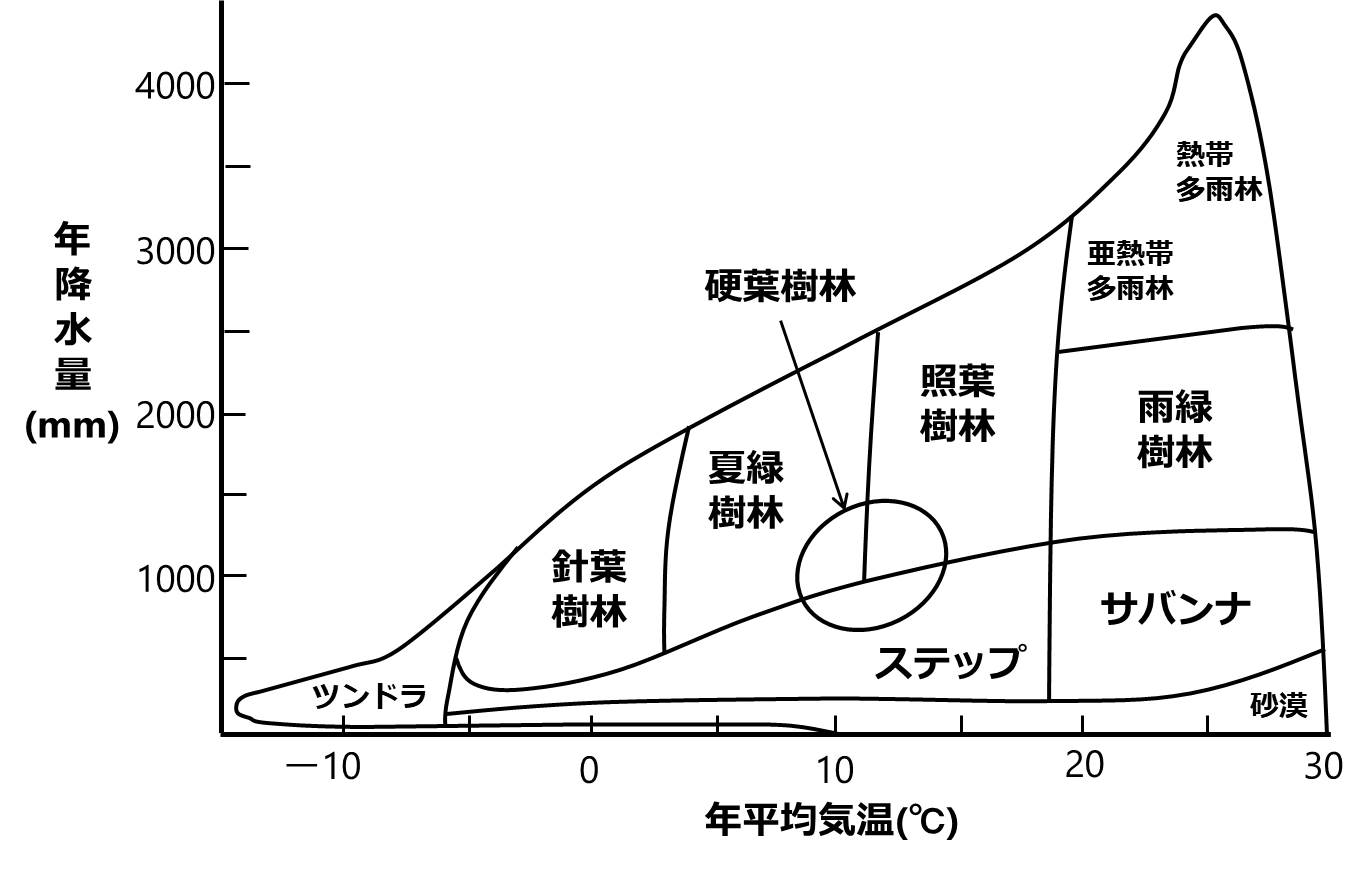
バイオーム 語呂合わせ, 気候とバイオーム 図 – Pebble Maths
これは当時のモンスーンアジアの年降水量分布です。ここから各地域の降水量の特徴と“風土”との関係を読み取ることはできますか。

これは当時のモンスーンアジアの年降水量分布です。ここから各地域の降水量の特徴と“風土”との関係を読み取ることはできますか。
地中海沿岸の気候 | 地中海性気候 分布図 – TGOC

地中海沿岸の気候 | 地中海性気候 分布図 – TGOC